Cadillac EU
Test Drive Booking
I designed this feature in anticipation of bringing more test drive locations to the GM Europe market. In this case study, I will walk the reader through each step of the design process I followed to create a new interface for booking test drives.
Step 0
Proposed Solution
I set out to design an experience that would allow potential customers to book a test drive at one of these locations, and additionally, quick-book any available same-day appointments.
Step 0
Problem Space
General Motors’ Europe presence is a relatively new venture, with lesser market presence than in the US, and very few (1-2) Cadillac storefront locations available in each country.
Role
Lead Product Designer
Tools
Figma
draw.io
Cadillac Europe Component System
Sessions
Stakeholder Review
Design Critique
Duration
One Sprint
Step 1
Requirements Interpretation
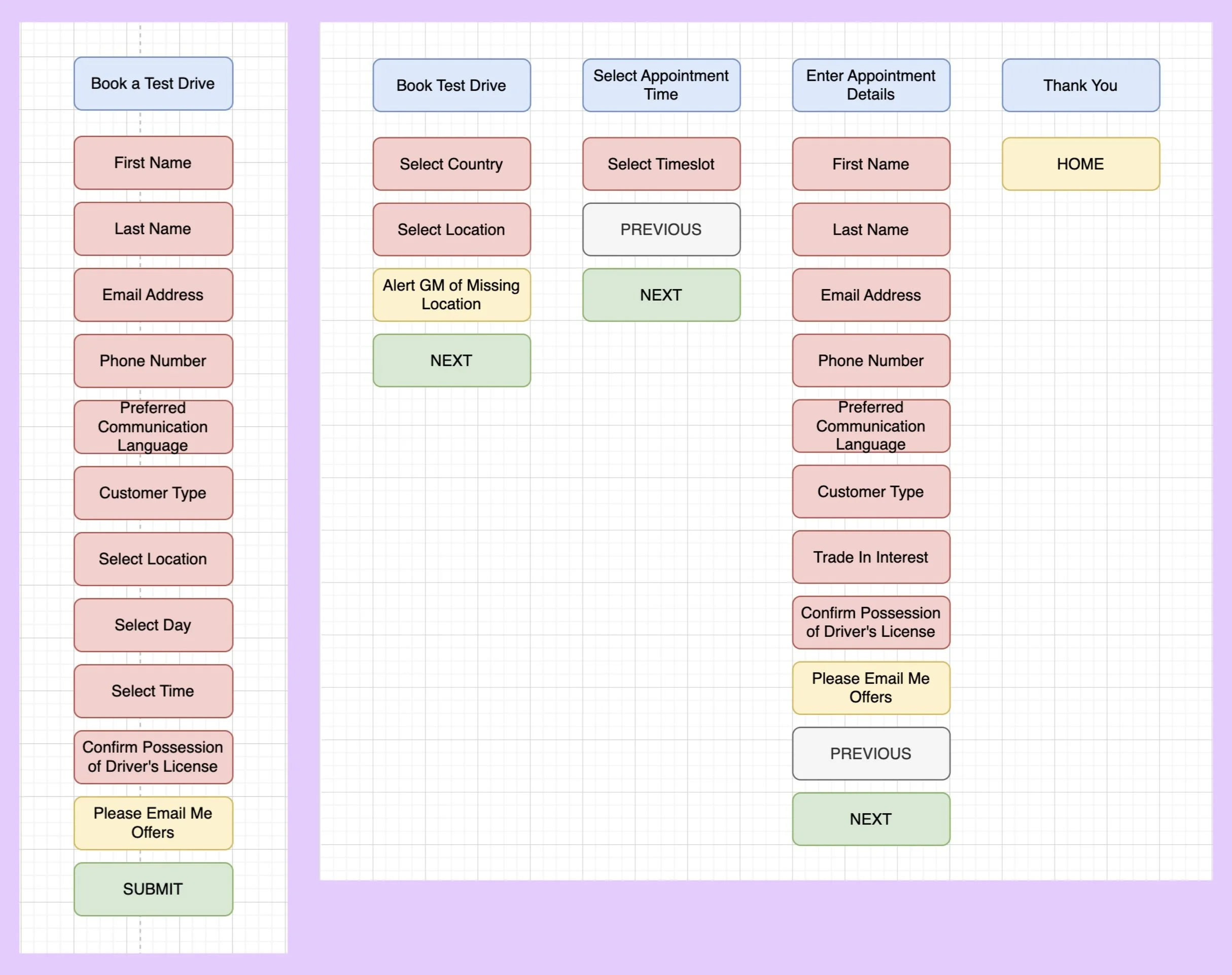
To begin, I translated the table of requirements to a flowchart depiction.
I denoted which features were nice to have and which were required with color. I then discussed this with my business partners, ensuring that all requirements had been properly captured.
Step 2
Interaction Design and UX Mapping
After studying existing designs for Cadillac Europe, I considered two styles of interaction for the main page of this experience:
The first: a single page form that would intake all of the user’s information, following the formatting of other forms currently on the website and product detail pages.
The second: a modal experience with a stepper, following the formatting of the site’s interaction to schedule vehicle pickup.
Step 3
Wireframing
Following the mapping exercise, I concluded that breaking a simple form out into steps may be likely to induce user fatigue, and decided to move forward with the single page format for the main experience.
I created a simple wireframe demonstrating what the user would need to view and input in order to book a test drive.
I also included the tertiary interaction of requesting test drive availability in the user’s area.
Step 4
Prototype Ideation
After meeting with design leadership, I was asked to prototype both versions I had originally mapped.
I created mid fidelity versions of both experiences using the Cadillac Europe styling.
My preference remained the form version, as it was even more evident now that especially with spacious styling considerations, many pages of the stepper would be required to host all of the necessary actions, and would result in user fatigue.
With my hunch confirmed by a team critique I hosted, I moved forward with refinement and adding tertiary features…
Step 5
Refinement and Tertiary Features
Time to dress it up!
After several iterations, the main format of the experience was decided. I added on the missing features and conducted another critique session for visual design. When designs were locked in, I created mobile responsive designs to match.
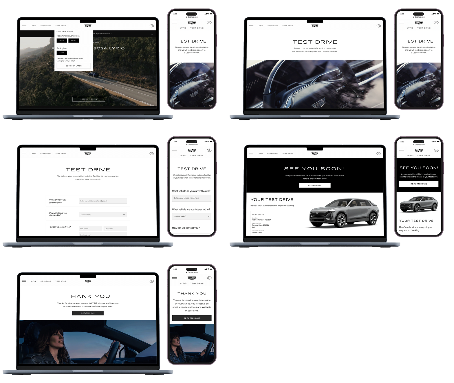
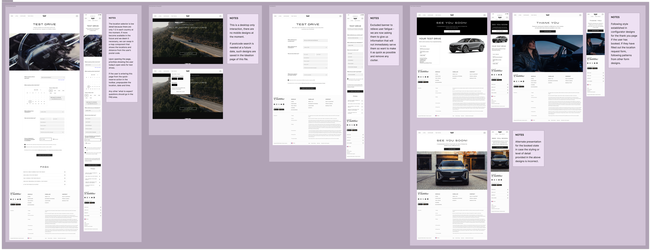
The final delivery of my work, organized and with notes, can be viewed to the right; below is a click through of the main interaction and two tertiary interactions.


